Friday, 7 June 2013

PROJECT 3- Built Form and Layout

LAYOUT AND BUILT FORM RESOLUTION. 

One of the key aspects of the design which was found to be in need of resolving, was the built form and layout of the gallery and workshop spaces.

The grouping of service spaces in the central void of the building opened up space and the opportunity to stretch the workshop space over a number of levels. 

These developments of the two key spaces are shown and explained below. 

Gallery layout

The diagram above shows the new form of the gallery space. Additions such as the elevator on the top left and the various small pod like exhibition spaces provide a different feel to the space and alter the flow through the gallery. The diagram also shows the possibility for the space to flow down from the first floor to the ground level, resulting in a large space and floor to ceiling window that will capture views of the city. These step downs can be used as informal seating, and the public would be welcome to perch on the steps and admire the view. 

Possible "infill"
The yellow dots indicate "podiums" or similar infill solutions that will display items. As the nature of the gallery is very vague, a nu,ber of different sized display spaces have been produced. Wall hanging spaces for artwork, larger podiums for bigger objects and smaller podiums for objects not requiring a large display area. The infill solution needs refining in terms of its form and materiality. 
Circulation
The circulation diagram shows how the new layout forces users to visit and travel through the entire gallery space. In previous iterations this was not always obvious. 


A similar study was carried out for the workshop space. 

Workshop space
The workshop space is located on the ground floor and has a strong connection to the public spaces around the building. Access would be via the public walkway that connects the parkland and riverfront deck spaces or via the gallery space and the sculptural staircase that is the focal point of the void. The workshop space needs to provide an environment that is adequately designed and effective as a teaching space. The manipulation of the built form allowed the loading dock and overflow spaces to be relocated a screening device will provide a sense on enclosure and security. 
Possible infill and openings
 A rough infill solution is pictured above. This solution utilities a raised teaching area, that flows outside the building envelope. This will allow the deck space to be used as additional teaching space, or as an outdoor classroom for activities that may not be suited to the interior. Workstations are focused towards the teaching area and follow the curve of the building. The image also shows the implementation of "operable" walls. These are walls that can be opened and closed and are not fixed in any one position. This will allow ventilation and light into the building, provide views out, connect the workshop and public space and also provide the potential to blackout the workshop if required. 

Circulation
The circulation diagram provides an indication of how people may use and flow through the space. This is not as integral as the circulation of the gallery, however, it was still useful to explore. 

Thursday, 6 June 2013

PROJECT 3- Circulation and Access Development

CIRCULATION AND ACCESS DEVELOPMENT.

Various diagrams were produced in attempt to visualise circulation through the various spaces in the building. This also displays the manner in which different spaces will be used which allows the infill to be designed to suit the use of the space.

These explorations and the findings are shown below. 


Ground Floor Access and Circulation
YELLOW= ACCESS POINTS
RED= CIRCULATION PATHS
This diagram shows how people would move through the various spaces on the ground floor. The connection between the public space and the parkland is evident. 

First Floor Circulation
RED= CIRCULATION PATHS
The first floor is a very busy level as it holds the gallery space and a large outdoor area, this is evident in the circulation plan, as almost all areas of the level are used. 

Possible Infill layout for the gallery space.
GREY= "PODIUMS"
The circulation plan highlighted the necessity for an effectively planned infill solution in the gallery space. Ideally, the infill should be intrusive on the space but still effective in displaying the various items that will be exhibited. 

Second floor circulation. 
This circulation plan also highlights the need for effectively designed infill. The level is predominantly a public space with a small cafe. Seating options should be versatile, flexible and diverse. 

Possible infill solution
BLUE= CAFE
YELLOW= ELEVATOR
ORANGE= AMENITIES
GREY= INFILL
The rough infill solution displays the potential to utilise various levels on the roof deck. This will create an interesting and more diverse space. 

Section circulation and access

Throughout the circulation explorations, it became obvious that there was the potential to group services and amenities together in a central shaft, located next to the elevator. This will allow for plumbing and other similar services to be easily installed and planned. This service shaft is highlighted in the section below. 

Service and amenities shaft. 

This central shaft will hold toilets, a small storage space and space to carry services such as electric and plumbing to the various levels. This new shaft also led to a development in the built form of the design. The additional structure produced an abstraction of the building envelope and a rough, initial image of this is shown below. 

Redeveloped form and layout
As shown above, the new services shaft breaks up the curve of the northern facade. This allows the workshop space to be better manipulated to provide views and also provides a tangent for the proposed loading dock and overflow zone to run off. This small setback in the facade can create an interesting effect and will be explored further.

PROJECT 3- Access and Zoning Development

ACCESS AND ZONING.

To simplify and help to resolve the spatial layout, proposed access points were developed and specific, function based zones were highlighted in the building.

This will help to resolve the floor plans and assist in ensuring that each space displays the proposed spatial qualities.

Proposed access plans are shown below.

Proposed site access
GREEN= EXISTING PATHS
RED= PROPOSED PATHS
BLUE= BUILDING ENTRY POINTS

Building access
ORANGE= PROPOSED PATHS TO THE BUILDING
GREEN= PRIMARY ACCESS POINTS
YELLOW= SECONDARY ACCESS POINTS

The access plans identify spaces that will be used heavily and areas that will shape and inform the users impressions of the building. 

Various zoning diagrams are shown below.

Ground Floor Zoning
BROWN= OUTDOOR PUBLIC SPACES
BLUE= GALLERY
ORANGE= STORAGE/TOILETS
PURPLE= VOID
GREEN= WORKSHOP
LIGHT GREEN= LOADING ZONE/OVERFLOW

1st Floor Zoning
LIGHT BLUE= STEPPED GALLERY SPACE
BLUE= GALLERY SPACE
PURPLE= VOID
LIGHT PURPLE= OUTDOOR DECK SPACE

2nd Floor Zoning
BROWN= DECK SPACE
PURPLE= VOID
MAROON= CAFE
RED= TOILETS

Section Zoning
BLUE= GALLERY
GREEN= WORKSHOP
LIGHT GREEN= PUBLIC PATH THROUGH BUILDING
YELLOW= PUBLIC SPACES
PURPLE= CENTRAL VOID
MAROON= CAFE
RED= SERVICES/AMENITIES

The zoning diagrams have helped me to wrap my head around the various spaces in the building and the layout of the spaces.


PROJECT 3- Siting and Built Form Development.

SITING AND BUILT FORM DEVELOPMENT. 

After generating the initial form and layout of the interaction centre, the design was placed on the site to establish its effectiveness in connecting to the environment and to establish how the building would sit on the site. 

This was done using a rough massing model of the site on Revit. This process allowed me to visualise the manner in which the building would connect with the site and also highlighted any changes that needed to be made to the built form of the building. 

Images and an analysis of the built form and siting are shown below. 

Contextual View

Close up View

These two images provide an overview of the orientation and context of the building. Immediately there are issues regarding the form and the angles of the views that are projected out. 

3d View

3D View 2

Eye level 3d view

Eye level 3d View
The 3D views indicate certain effective aspects of the built form and the siting. The manner in which the gallery space projects out over the river is quite effective and is an area that could be explored further. The way the curve of the building follows the rivers edge is also quite good and helps to connect the building to the site. 

However, as mentioned before, the form of the building somewhat marginalises views towards New Farm and adjustments are needed. This is shown in the analysis below. 

View Analysis
GREEN= EXISTING DESIRABLE VIEWS
RED= EXISTING UNDESIRABLE VIEWS
ORANGE= PROPOSED DESIRABLE VIEWS

The image above clearly indicates the flaws in the built form and the manner in which views are focused out of the workshop. 

Proposed Adjustments
GREEN= DESIRABLE VIEWS OUT
ORANGE= EXISTING VIEWS OUT
RED= PROPOSED FORM
BLUE= PROPOSED LOADING ZONE/OVERFLOW
ORANGE= POSSIBLE INFILL SOLUTIONS
YELLOW= PROPOSED RAISED "TEACHING" PODIUM

As shown above, a simple manipulation of the workshop space can provide better views out of the space and create the loading zone and workshop overflow space that is required in the brief. The readjustment also opens up the ability to readjust infill and focus the work spaces towards the rover and a raised platform space that can flow onto the outdoor deck. This will enable the deck to be used as part of the workshop space or as viewing space for exhibitions or demonstrations. 

Staircases

STAIRCASES. 

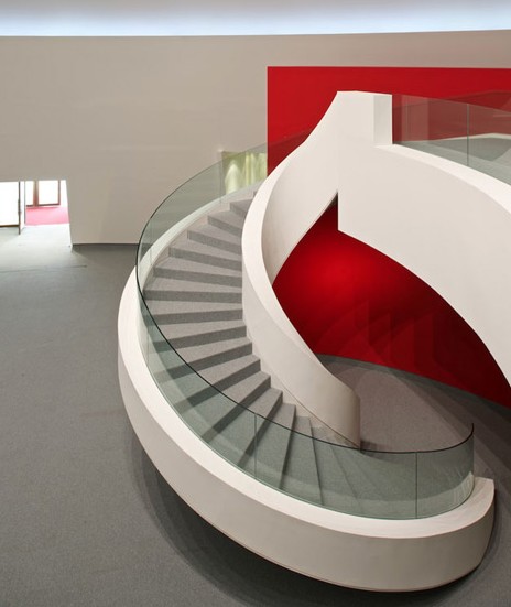
The central staircase has been established as a key feature in the building design. 

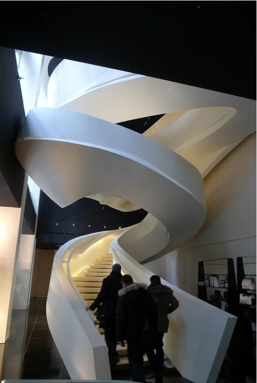
The opportunity to manipulate the form of the stairs and experiment with various materials is immense. I have turned to various existing examples for inspiration, some of these are shown below. 


Many of the stairs pictured above are more than just simply stairs and go past the simple functionality of the regular staircase. These staircases transform spaces and become focal points and notable features of the spaces. They prove that staircases can be sculptural and beautiful.

The final staircase pictured is in the refurbished Armani store in New York City. I was lucky enough to visit this store, and the staircase was definitely the main element and focal point within the shop despite it being surrounded by ridiculously priced clothing! The staircase flowed and integrated seamlessly into its environment and the irregularity of its form is captivating. 

PROJECT 3- Layout and Form Development- Revit Model

LAYOUT AND FORM DEVELOPMENT- REVIT MODEL.

The rough plans shown in the previous post were transferred into a Revit model.

This provided an option of mediums to work from and a 3 dimensional representation of the built form. 

Images are shown below.


The Revit model helps me to visualise ideas that i am having trouble sketching, due to my broken wrist and also allows me to experiment with various materials and spatial layouts.