Wednesday, 5 June 2013

PROJECT 3- Layout and Form Development.

LAYOUT AND FORM DEVELOPMENT. 

Further development of the built form and spatial layout is shown below. 

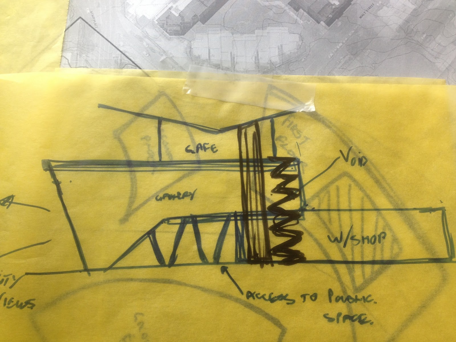
One notable inclusion is the addition of a central void space and the relocation of the workshop and gallery spaces. The gallery has been moved to the western side in an attempt to make the most of the city views. The main access point has also been relocated and this has resulted in a manipulation of the gallery space and it now flows over multiple levels. 

The gallery and workshop spaces are joined by a central void that uses a sculptural, circular staircase as a key element to connect the levels and provide a focal point within the space. 

Images of the development are shown below. 


GROUND FLOOR
An initial version of the first floor is shown below. 

FIRST FLOOR

The 2nd floor plan is shown below.

SECOND FLOOR

Iterations of the gallery space and sections of the space are shown below. 

(Apologies for the orientation, Blogger won't let me rotate them)


This new spatial layout was designed with the circulation and use of the building in high consideration. Further development of these aspects is required. 

Tuesday, 4 June 2013

PROJECT 3- Ideas and Development

IDEAS AND DEVELOPMENT. 

I'm finding it a bit hard to wrap my head around the brief and always seem to be forgetting certain aspects of it. As a result, I have decided to compile a list of requirements, a list of areas that need more development and a list of ideas that i have for the building and various spaces within it. I'm hoping that this will help me to clarify what is required and help me to further develop the project in a more structured manner. 

Requirements from the Brief:

  • A group of flexible spaces that will be for the community use of pop-up workshops, teaching, retail, exhibition and events. 

    1. THE WORKSHOP
    • 200 sqm  
    •  Room for hire for teaching/making workshops focused on hands on craft. 
    • Work benches
    • An inventive solution to supply services to the work spaces- power, water, lighting etc
    • Provision of natural light and ventilation.
    • Ability for a full black-out for presentations
    • Opening to the gallery that merges the two spaces together
    • Access to the loading dock
    • Access to bathrooms
         2. THE GALLERY
    • 200 sqm
    • Display of retail products or objects produced in workshops
    • Infill such as shelving, podiums and other inventive solutions
    • Large entry threshold that controls access to the whole building 
    • Access to bathrooms and storage
    • Opening to the workshop
         3. ANCILLARY SPACES
    • Bathrooms- as required
    • Storage- as required
    • Loading dock that may acts as overflow to the workshop
    • 30 sqm retail tenancy- Cafe 
      • Indoor and Outdoor seating
      • Ability to fully open and close securely when not in use
         4. MATERIAL CONSIDERATIONS
    • A material for the skin
    • A material for the openings
    • A material for infill

    IDEAS FOR THE INTERACTION CENTRE. 
    • Easy access to all spaces
    • Sub-tropical, climatically sensitive design
      • Lots of natural ventilation
      • Correct orientation
      • Shading devices
    • Interesting and innovative use of different materials 
      • Natural and man-made
      • Traditional and modern
    • Make the most of the site
      • Views
      • River front
    • Connect the building to the site
      • Connection to proposed parkland
    • WORKSHOP
      • Traditional materials
      • Timber 
      • Concrete 
      • Corrugated iron
      • Outdoor courtyard deck space
    • GALLERY
      • Modern materials
      • Open plan
      • Concrete
      • Glass
      • Views out
      • Outdoor gallery space

    ASPECTS THAT NEED DEVELOPMENT.

    • Built form
      • Spatial layout and siting
      • Overall volumetric shape of the building
    • Materials
    • Openings
      • How will the workshop black out?
      • Will openings be habitable spaces?
      • Materials
    • Infill
      • Innovative solutions
      • Materials
      • How do they affect and shape the spaces
    • Access and Circulation
      • Stairs?
      • Main entry point
      • How do people move through the building?

    Monday, 3 June 2013

    The Orange Cube

    THE ORANGE CUBE

    The Orange Cube is a tertiary institution design by Jakob and McFarlane Architects. The building consist of a volumetric cube that has a conical opening cut out of it.

    The building displays interesting planning, volumes and material qualities. The skin of the building is made up of a membrane with various openings cut out of it. This manipulates light into the building, views out of the building and also creates an interesting aesthetic.

    Such a skin treatment would be effective on the northern facade of the proposed structure for project 3.

    Images of the building are shown below.


    Images sourced from:


    Stamp House

    STAMP HOUSE

    The Stamp House is a unique, sculptural concrete building. 

    The use of concrete in a residential building is not too common, and the dominance that it has in the Stamp house is quite eye catching. 

    The house displays a sculptural, angular form that is accentuated and emphasised by the concrete. The use of concrete is also more surprising given the location in Queensland. However, it is justified by the fact that the house needs to withstand cyclones and tropical storms. 

    The spatial layout and siting of the house are also unique features of the design and the manner in which various elements hover off the ground is interesting. 

    Cantilevers and other similar aspects are elements of the design that can be explored in project 3. 

    Images of the house are shown below.


    More information and images at:

    Operable Facade Pittwater

    OPERABLE FACADE PITTWATER

    This design by Andrew Burgess uses a unique facade to blur the line between internal and external spaces and redefine the function of the building facade.

    The house employs an interesting facade treatment, that is made up of a series of timber panels that open up to expose views and allow light and ventilation into the building.Opening these shutters effectively removes a wall from the building and the effect is obvious. 

    The material selection is also aesthetic and functional. Timber allows the shutters to be lightweight and somewhat permeable.

    A similar device or facade treatment could be used in project 3. This would allow the internal spaces and activities to be carried out into courtyards and other similar spaces. 

    Images of the house are shown below.


    Images sourced from:

    Gabriela Mistral Cultural Centre

    GABRIELA MISTRAL CULTURAL CENTRE

    Designed by Cristian Fernandez Arquitectos and Lateral Arquitectura & Diseno the cultural centre is based around the concept of openess and transparency and provides a large public space that transforms the streetscape. 


    The building is directly related to its surroundings and adresses the urban environment in various ways. The large elevated mass creates an interesting public space underneath it and the use of various materials amplifies the spatial qualities. 

    The building uses aged metal and concrete as the main materials and the effect produced is aesthetically pleasing. 


    Images of the building are shown below:


    Images Sourced from:
    http://www.archdaily.com/81725/gabriela-mistral-cultural-center-cristian-fernandez-arquitectos-lateral-arquitectura-diseno/ 

    "Fancy" Retail Headquarters

    "FANCY" RETAIL HEADQUARTERS

    The Fancy retail headquarters displays a use of corrugated iron and timber, similar to the initial proposal for the workshop space in project 3. 

    The building also has a large window that focuses views out, in a manner similar to the what is required in project 3. 

    Images of the building are shown below. 


    Images Sourced from: 

    Torquay House

    TORQUAY HOUSE

    This house is another great example of a beautiful timber facade. 

    The timber slats manipulate the facade and create an interesting materiality. The house also provides an interesting contrast between concrete and timber and shows that this can provide an interesting aesthetic.

    The house also possesses an interesting form and is made up of a number of rectangular prisms. These are arranged to create internal courtyard spaces and this is an element of the design that could be explored in project 3. 


    Images Sourced from:

    PROJECT 3- Spatial Layout Development

    SPATIAL LAYOUT DEVELOPMENT.

    An initial investigation into possible spatial layouts of the building was investigated. 

    Given the fact that i i broke my wrist, the quality of the drawings is not the greatest, so please excuse the untidyness. 

    The investigation focused on organising the spaces and grouping similar elements such as the services together in an attempt to free up the workshop and gallery spaces of unnecessary clutter and obstructions. The basic form was derived from the massing developments and the arcing building with 3 levels and 2 active rooftops was used as a base template. 

    The various sketches developed are shown below. 
     *please note that all the images are upside down, blogger did this and there is no option to rotate them*

    basic Block layout
    The basic layout was based on a single level and focused on providing views back towards the city and activating the waterfront. 

    Initial- Single level Arch layout.

    The initial arched layout was also orientated around focusing views back towards the city. 

    Detailed Arch Layout
    The image above shows the allocation of spaces within the initial layout. The grouping of supporting spaces is noteworthy as is the riverfront public space. 

    Exploration of singular spaces
    The various spaces were then divided up so that they could be viewed in isolation. This helped me to understand what is needed in the building and refine the adjacencies. 

    Initial Multi-Level Layout

    This image shows the plan of the multiple levels and how they sit upon one another. 

    Multi Level plan 2.
    This plan explores the various rooftops and the basic layout of the building. 

    Ground Floor Plan

    The ground floor plan shows the allocation of spaces and the grouping of services. It also highlights the nature of the built form, and the fact that there are two different structures. The pathway and connection between the parkland and the riverfront public space is evident. 

    1st Floor Plan
    The first floor plan is made up of the gallery space and the rooftop deck above the public space. This image also shows possible access points to the space. 

    3rd Floor Plan
    The 3rd floor plan is another public space that consists of a cafe. This space is proposed to have great views and an open air, semi outdoor cafe space. 

    POINTS TO FURTHER EXPLORE. 

    This investigation has highlighted the need to resolve the circulation plans within the building and investigate access options to the various levels. The use of stairs could provide an interesting built form and an architectural element. The need for interesting infill solutions that make the most of the built form and the view out of the building is also an important element that needs to be considered. 


    Wednesday, 29 May 2013

    Meditterani 32

    MEDITTERANI 32

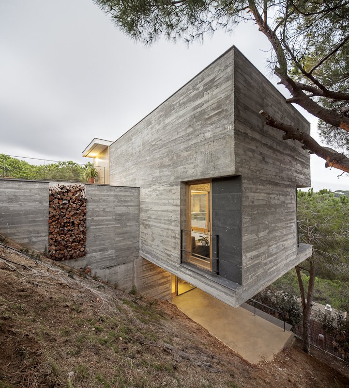
    Designed by Daniel Isern, the Meditterani 32 house is a perfect example of how raw materials can come together to create a beautiful building. 

    The house displays an interesting use of timber finishes and raw concrete surfaces, along with large windows and outdoor areas to reinforce the connection to the environment. 

    The aged timber wall finish provides a unique aesthetic and helps the house blend into its forest setting. 

    Images are shown below. 


    Images Sourced from: