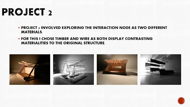
FINAL REFLECTION.
PROJECT 3-
Overall, I think project 3 went quite well. I found the brief and material them interesting and engaging. I would have loved to have had a more hands on approach to the project and made use of physical models. however, circumstances prevented this, and I think the use of digital models was successful to a degree.
I was pushed out of my comfort zone and forced to experiment with computer programs I don't usually rely on, and I think this was a good learning experience for me. The final design captures the desired material applications and successfully integrates into its surroundings. The building enhances the parkland space and provides the site with an eye catching landmark.
I would have loved to give a proper presentation of the design as i feel a lot of the finer details were glossed over in the power point and it was simply impossible to fit everything in, without writing an essay on each slide. However, i do feel that the power point and poster capture key points and the overall concept of the design effectively.
The design itself was developed in a way that i am not accustomed to, but I found its development to be quite interesting, but challenging at the same time. My inability to sketch out ideas made it hard for me to develop the design and i was forced to use other means to keep my thought process going. The use of foam massing models to develop the built form is an example of this.
I feel like under different circumstances, the final outcome would probably have been radically different, but i still think this design is effective and meets the goals that i set out to achieve.
THE WHOLE SEMESTER-
I think this semester has gone fairly well.
It has had its ups and downs but the outcomes of all 3 projects has been relatively good. I have found each project interesting and engaging and i feel like my skills as a developing architect have definitely been enhanced.
The interaction node made me think about how a simple architectural insertion can change a space and affect the users. This influenced my final design as i was always thinking about the effect the building would have on its surroundings and how it could enhance the parkland. This led to the development of the various public spaces around the building.
The material exploration in project 2 was interesting and i particularly enjoyed the physical model making. The opportunity to reevaluate the node also made me realise the importance of materials within a design and how they can be functional rather than aesthetic, or a combination of both.
Project 3 was challenging but again engaging and enjoyable. The simple and unrestricting program made it possible to develop various public spaces around the building and enhance its integration into the site. The final design was influenced by both project 1 and 2 and was effective in achieving the desired goals.
The blog was another aspect of the semester which i found useful and quite enjoyabel, (as you can probably tell). It allowed me to share interesting uses of materials and provided somewhere that all my thought processes could be recorded. This also provided me with somewhere that all my previous thoughts and ideas were stored and could be easily accessed.
OVERALL, i think the semester went fairly well and given the circumstances the final project was successful.
DAB510- 2013 - Architectural Design 5
Friday, 21 June 2013
Thursday, 20 June 2013
PROJECT 3- Summary
PROJECT 3 SUMMARY.
At the start of project 3, I set out to design a building that was connected to the site, used materials in an interesting way and enhanced the site and the surroundings. Although I have had a few setbacks along the way, i believe that the final design satisfied all of these aims.
The final design uses materials to influence the spatial qualities of various areas within the building and provides numerous public spaces which enhance the proposed parkland space. The public deck provides a strong connection to the river, while the garden deck spaces are ideal for the Brisbane climate and ensure the building is eye catching and interesting when viewed from all angles, including the top of the cliffs.
The gallery focuses views out towards the city, while the workshop is versatile and unrestricted in its use. The facade treatments further enhance the connection to the site and the significance of the site within the city. The Story Bridge inspired steel frame that supports the curtain wall creates interesting shadows inside the building. The metal facade on the northern face of the building also emphasizes the significance and the location of the building within the city. This facade uses metal to create a contrast between the timber cladding and concrete surfaces, and the use of perforations and cutouts creates interesting shadows and manipulates views out of the spaces.
The spatial layout is effective and the flow of the spaces is logical yet not limited. The layouts and built form allowed for the incorporation of the public corridor, and also the development of the large, open gallery. The public corridor is key to connecting the public spaces around the building, and similarly, the circular staircase which occupies the void is key to connecting the various levels. The sculptural form and use of interesting materials make the staircase a key component of the design and allow it to become a focal point within the void.
Infill solutions are simple yet effective and relate to the materials that surround them. The workbenches are functional and aesthetic and the use of recycled materials makes them sustainable. The gallery podiums are unrestricted in their function and intrusive within the gallery.
Openings are effective in allowing light and ventilation into the building. The operable walls allow the gallery space to open up and overflow out onto the deck space. Large folding doors set into the curtain walls open up the deck spaces on the first and second levels. These doors are framed by a thick metal frame which creates a large threshold and an interesting material effect when set into the glass walls.
Overall, the building is easily accessible, versatile in its use and integrated into the site seamlessly. The public spaces enhance both the Interaction Center and the public space that surrounds it and the building is an eye-catching landmark within the site.
PROJECT 3- Perspectives
PERSPECTIVE RENDERS.
A series of perspective renders of the final design are shown below.
These renders capture the quality of the spaces and indicate how people may use them.
A series of perspective renders of the final design are shown below.
These renders capture the quality of the spaces and indicate how people may use them.
 |
| EXTERIOR PERSPECTIVE VIEW |
 |
| MAIN ENTRY PERSPECTIVE |
 |
| GALLERY INDOOR PERSPECTIVE |
 |
| GALLERY INDOOR PERSPECTIVE |
 |
| GALLERY LEVEL 2 PERSPECTIVE |
 |
| WORKSHOP PERSPECTIVE |
 |
| CAFE INTERIOR PERSPECTIVE |
 |
| OUTDOOR DECK EXTERIOR PERSPECTIVE |
 |
| GARDEN DECK PERSPECTIVE |
 |
| NORTHERN FACADE PERSPECTIVE |
PROJECT 3- Final Drawings
FINAL DRAWINGS- PLANS, SECTIONS, ELEVATIONS.
The final drawings used in the presentation are shown below.
Details:
The final drawings used in the presentation are shown below.
 |
| SITE PLAN 1- RIVERFRONT DECK 2- PARKLAND 3- EXTENDED BOARDWALK 4- VEHICLE ACCESS 5- PROPOSED PARKLAND |
 |
| SITE SECTION 1- PARKLAND 2- PUBLIC CORRIDOR 3- PUBLIC RIVERFRONT DECK 4- GALLERY 5- CAFE |
 |
| GROUND FLOOR PLAN 1- MAIN ENTRY 2- GALLERY 3- STORAGE 4- PUBLIC DECK 5- PUBLIC CORRIDOR 6- LOBBY/VOID 7- WORKSHOP 8- LOADING DOCK/OVERFLOW |
 |
| FIRST FLOOR PLAN 1- GALLERY 2- VOID 3- OUTDOOR GARDEN DECK |
 |
| SECOND FLOOR PLAN 1- VOID 2- INDOOR SEATING 3- CAFE 4- OUTDOOR GARDEN SEATING |
 |
| SECTION 1 |
 |
| SECTION 2 |
 |
| AXO SECTION 1 |
 |
| AXO SECTION 2 |
 |
| NORTH ELEVATION |
 |
| WEST ELEVATION |
 |
| SOUTH ELEVATION |
 |
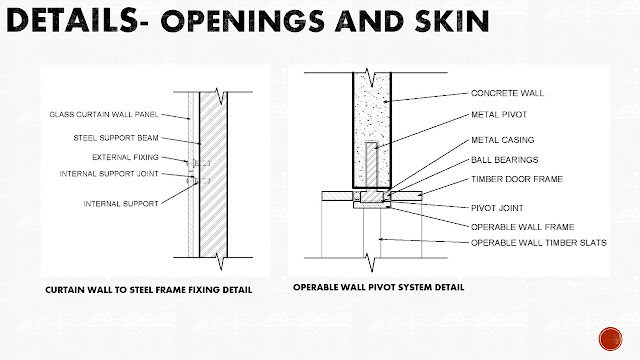
| GLASS TO STEEL FRAME DETAIL. |
 |
| FACADE TO CONCRETE WALL DETAIL |
 |
| FACADE TO GLASS DETAIL |
 |
| OPERABLE WALL PIVOT DETAIL |
 |
| OPERABLE WALL CLOSE UP |
 |
| STEEL FRAME AND CURTAIN WALL CLOSE UP |
 |
| CONCRETE FINISH CLOSEUP |
Subscribe to:
Posts (Atom)


