Wednesday, 29 May 2013

Meditterani 32

MEDITTERANI 32

Designed by Daniel Isern, the Meditterani 32 house is a perfect example of how raw materials can come together to create a beautiful building. 

The house displays an interesting use of timber finishes and raw concrete surfaces, along with large windows and outdoor areas to reinforce the connection to the environment. 

The aged timber wall finish provides a unique aesthetic and helps the house blend into its forest setting. 

Images are shown below. 


Images Sourced from:

Element House

ELEMENT HOUSE

Designed by Sami Rintala, this house has a strong relationship with its surroundings and an intriguing combination of materials. 

The house is made up of a series of blocks stacked and manipulated to create interesting opening and extrusions of the built form. The boxes are clad in either timber or metal and this combination creates an interesting materiality. 

The house frames views out and possesses a number of indoor/outdoor courtyard spaces. Openings in the built form manipulate light and create beautiful spaces within the structure. Elements such as these would be desirable in the project 3 design proposal. 

Images shown below. 


Images sourced from:


Tchoban Foundation

TCHOBAN FOUNDATION- MUSEUM FOR ARCHITECTURAL DRAWING

The Tchoban foundation uses interesting angles and forms to create an eye catching built form. 

The building is made up of a number of stone blocks stacked upon one another at various angles to create contrasts and an interesting facade. 

The building also possesses a large glass box on the top level. This space floats over the street and a similar element could be explored in project 3. 

Images are shown below. 


Sourced from:

Wall House.

WALL HOUSE

The Wall House is unique in its structure and construction. 

The house is made up of  a number of prefabricated panels, many of which incorporate furnishings such as shelving. These panels form the key structural elements of the house and the central element. This is then covered in a series of finishings. Glass  windows are applied and a large translucent cloth is draped over the building. 

This makes the house seems like a huge tent and creates interesting and unique spatial qualities. 

Images are shown below. 


Images sourced from:

Home for the Elderly

HOME FOR THE ELDERLY

This project designed by Baena Casamor Arquitectes has a number of intriguing features. 

The old age home uses an eye catching combination of ceramic tiles and timber to create a unique aesthetic. The ceramic tiles form the external skin of the building on two of the sides while large windows and timber slats form the raining two facades. The Timber elements provide privacy and an interesting aesthetic. 

The building also has a fascinating relationship with the site as it connects the street on one side of the building to a public park space on the other. This is done through a public lobby space and is an element that can be explored in project 3. 

Images are shown below. 


Images and information sourced from:

Won Dharma Centre

WON DHARMA CENTRE

This spiritual and recreational Buddhist retreat makes the most of natural materials to create an interesting design. 

The buildings use timber structural members as well as finishes to create a humble and aesthetically pleasing design. The timber structures manipulate light and views and create interesting spaces around the buildings. 

The use of outdoor spaces is something that can be explored in project 3 and the protection provided by various timber structures is an interesting addition to these areas. The timber shading devices provide a sense of enclosure and protection without compromising the connection to the landscape and the surroundings. 

Images can be seen below. 


Images sourced from:

Don Cafe House

DON CAFE HOUSE

The infill in this design is the key element.

Designed by Innarch the design is a template for a number of similar projects that are part of the Don Coffee franchise. 

The infill solution is unique and beautiful. Curved wooden slats are sculpted to form walls that double as seats and embrace the user. The curvy nature of the seats creates an interesting aesthetic and a warm and welcoming environment. 

Images of the design are shown below.


Images sourced from:

Queenscliff Residence

QUEENSCLIFF RESIDENCE

Designed by John Wardle, this residential structure uses timber an an effective manner. 

The facade is made up of timber slats that create a sense of privacy and limit views into the house. They also manipulate light and create interesting internal spaces. 

The house frames views in an effective way and this along with the use of timber are elements that can be explored in project 3. The house also incorporates a courtyard space in an attempt to optimise its location and climatic factors. 

The challenge is to capture southern views, while still maintaining the required northern orientation and the courtyard space helps to do this. 

This is also an element of the design that can be further explored in project 3, as the same problem is present. 

Images of the house are shown below. 


This image shows the northern elevation of the house and the courtyard space that has been integrated into it. 


The Elevation drawing of the northern facade is provocative and clearly represents the material qualities of the facade. Drawings and renders such as this would be ideal for project 3. 


Images sourced from:

Hispasat Technology Center

CORPORATE OFFICE BUILDING FOR HISPASAT TECHNOLOGY

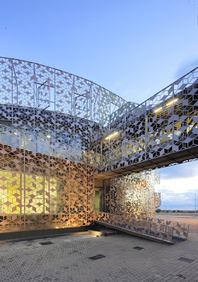
This corporate office building employs a unique outer skin to create an interesting and beautiful facade structure. 

The building is wrapped in a sculpted iron structure than manipulates light and distorts views in and out of the building. The finish of the skin adds to its effectiveness and reflects various colours in a delightful manner. 

The building is oval in plan and this creates smooth, flowing surfaces and an uninterrupted facade surface. The iron lattice structure also has various environmental benefits as it limits solar radiation entering the building. 

The building was designed by Herreros Arquitectos and images are shown below. 


Images sourced from: 

Wednesday, 22 May 2013

PROJECT 3- Massing Form Development- SKETCHUP MODELS

SKETCHUP MASSING MODEL DEVELOPMENT. 

As with the physical models, a number of sketchup models were created using 5 standard forms, arranged in various ways. The various forms resolved are shown below. 


Form 1.
A variation in the levels and heights of the buildings was then explored. 

Form 2.
Raising various portions of the model up a level was explored. This created some interesting forms and spaces as shown below. 

Form 3.

Form 3.

Form 4.

Form 4.

Again, curved structures were also explored and were found to be effective in creating flowing spaces and manipulating negative space and views out of the building. 


The forms developed are shown below.

Form 5.
The curved walls create a smooth flowing form. 

Form 6.

Form 6. 
Altering the heights of the buildings created a different effect. 

Form 7. 

Form 7. 
Raising portions of the structure provides the opportunity to activate rooftop spaces. 

Form 8.

Form 8. 
Altering the orientation of the buildings provides the opportunity to better manipulate views and control the spaces between the buildings. 

Form 9.

Form 9.

Form 9. 
The final form that was resolved provides the opportunity to activate two rooftop spaces. These can be public spaces or extensions of the gallery and workshop areas. There is also the potential to connect the parkland and the deck space through an opening in the built form. The model also shows some materiality and how the combination of concrete, timber and glass may look.